Cinequest is San Jose’s preeminent film festival, celebrating its 25th anniversary this year. In this daily film journal, I’ll be trying to spotlight films you might otherwise miss and let you know when you’ll be able to catch them again.
We’re at that unfortunate time in any film festival I can only write about films that have already had all their showings.
However, with Cinequest there is still the hope that any of the movies I’m able to review will get one final fling Sunday March 8th on “Encore Day.” Saturday night additional showings based on film feedback will be announced.
So with that in mind, may the reviews be ever in your favor.
Short Catch-Up Reviews
Catch today and watch for possible encores on Sunday March 8th.
Buy tickets here
Let’s dive right in here. Although I’ve written up a good many of the films I’ve seen at Cinequest, there are several I just hadn’t gotten to yet. Given this is the closing weekend and we have a day of encore showings on Sunday, I wanted to get some notes out to you and hopefully help your viewing decisions.
We’ll start with a couple of shorts programs. Short films are at once very important to a festival and at the same time difficult to review. Does one good entry make viewing all the others worthwhile? Do you really understand what a category is all about? Let’s check in on a few of this year’s offerings.
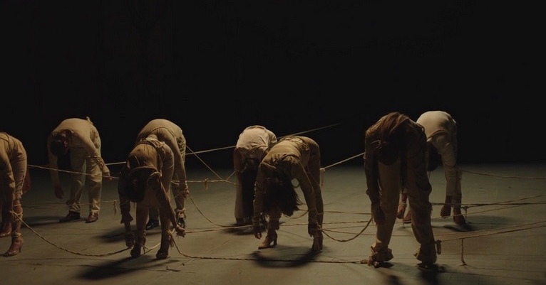
Shorts Program 4 – Animated Worlds

A good collection of animated styles and technologies, as well as storytelling excellence. This was my favorite of the shorts programs, hitting on both technical diversity and an array of stories that evoke so many different emotions and reactions. Highly recommended, you catch this if you can.
Shorts Program 5 – Mindbenders
 Another technically excellent set of short films. A wide array of filming techniques, some of these are specifically set to show off the mastery of craft and leave the story open to interpretation. Probably the widest variety of films in the shorts programs, never boring, something to challenge your mind and give you a ton to talk to other viewers and the filmmakers about.
Shorts Program 7 – Something Funny
 Where the short dramatic or experimental film is akin to a short story, the short humor piece is a couple of quick jabs to the funny bone and typically ends with a belly laugh. Easily the most accessible set of short films in the calendar, these uniformly deliver on the promise, you will laugh!
Now on to other feature films.
Dermaphoria
Directed and written by Ross Clarke
 Comparisons to Christopher Nolan’s Momento are obvious and easy to make to this story of an amnesiac chemist slowly regaining his memory after an explosion in a secluded drug lab. But the comparisons stop reasonably shallow because we’re not in the Nolan’s perpetually twisting puzzle box, here we’re in a compelling story of a potentially likeable narrator who is dealing with a wide array of uniquely dangerous individuals. While you may get a little tired of blurred images backing up the fundamentally unreliable narrator’s recollections, the film is solid and compelling.
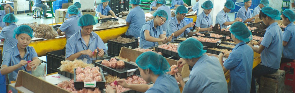
Factory Boss
Directed by Wei Zhang
 A solid cast provides insight into China’s factory system where laborers are a resource that is continually abused in the name of delivering exports at the lowest prices possible. Both sides are argued fairly in this dramatic story of what seems to be a no-win situation. This will provide some faces and situations to haunt you the next time you read a story about conditions in the factories where our iPhones are made.
(No iPhones were made in the filming of this movie.)
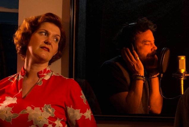
How to Lose Jobs & Alienate Girlfriends
Directed, Produced, and Starring Thomas Meadmore
 This film deserves a longer review. Thomas Meadmore has basically created a “selfie” documentary. His narrative starts with the availability of a willing and able mentor and the search for a documentary subject. In admitting he’s breaking the first rule of documentaries, you don’t influence the subject in the filming of the subject, he extracts himself from typical efforts and provides a second (third?) layer of narrative here. The musical goals of both his mentor and girlfriend are examined, recorded, and unintentionally sabotaged by his efforts. Really compelling in its honesty, Meadmore may just have invented a new documentary style.
In the Company of Women
Directed by Kahlil Silver, Written by and Starring Shogi Silver
 Another I deeply regret not covering in a longer review during the festival. The story of a male escort who is hired by an older man to be his “wingman” for an evening’s attempt at finding a woman who can replace is deceased wife. An evening of encounters and stories builds their relationship as neither expected. I think this stands a good chance at an encore primarily on the basis of young Shogi Silvers script, in which he authentically captures the complexity of the older man’s conflicts and desires.
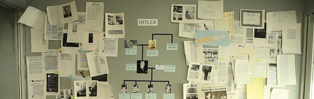
Meet the Hitlers
Directed by Matt Ogens
 What’s it like to have the name Hitler? An interesting and diverse investigation into a number of very different individuals who each share that one aspect of their lives. This documentary is at times a little scattered in its progress, and perhaps could have been served by a bit of editing for length, but the journey here is interesting and eye opening.
Sweden’s Coolest National Team
Directed by Per-Eric Malm
 A documentary about the world memory championships might sound a bit dry, but nothing could be further from the truth in this tale of an underdog group of Swedes who set out to bring home the trophy. Beyond the examples of mastering unthinkably complex sets of data, the personal stories of the four-man team are brought forward with both humor and quirky charm far too often missing in the documentary format. The silent struggles in the arena of the mind are awesome and inspiring.
So that brings me current with two days of Cinequest remaining. Remember that tonight, Saturday March 7th, the encore films for Sunday will be announced here. So watch and see what second chances might be available.
Ric Bretschneider
March 7h, 2015


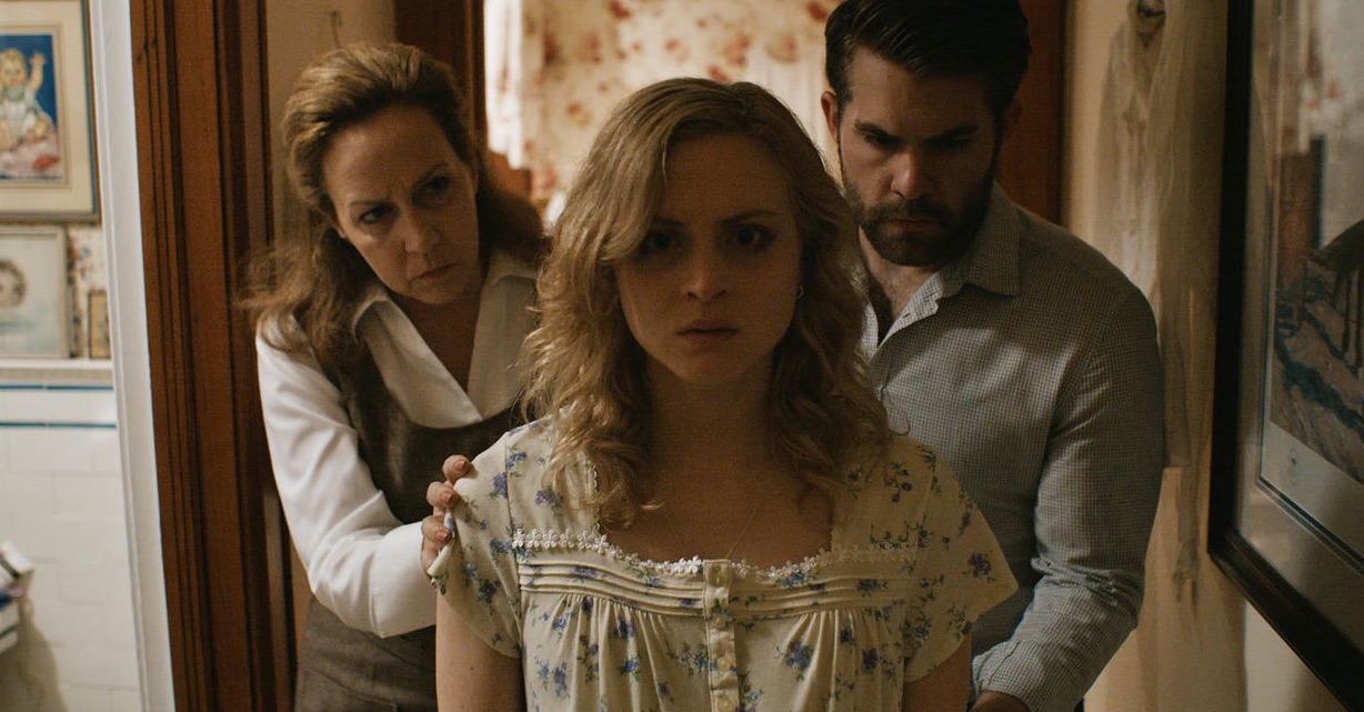

 Of course that isolates her more, the family still trying to work in her best interests now puts her much more in direct conflict with whatever is going on in their home. Her marriage is strained and we learn more about the problems she had in Chicago, which of course do not work in her favor here.


 Without giving too much away, the journey is unique, and the relationship… well, it’s fairly unique for a musical comedy.