Savino Wine Preservation System Unboxing

Sometimes we have to put the tech, and the presenting and the other stuff geeky aside and just enjoy a glass of wine.

But maybe we can combine a few of these. The latest tech in wine storage. The geeky flavor of an impromptu unboxing and demo. All on a Friday afternoon.

Enjoy.

Savino Wine Storage System Unboxing


Posted in Entertainment, Food and drink, Geeking around, Personal, Technology, Uncategorized | Tagged , , , | Leave a comment

Calming Down the Grandpa in Office 2013

I got a lot of good feedback on The First Thing to Do to Your New PowerPoint 2013, thanks and wow – happy to help.

So OK, here’s the second thing you should do after you install Office 2013.  It’s a bitter post, full of my opinion, and I’m perfectly willing to accept that others may disagree.  However, in my opinion this trick corrects one of the most ridiculous mistakes made in Office 2013. You may consider it more of a taste issue. But I think that if you have taste you’ll want your Office interface to not look like somebody’s grandpa sending e-mail with the CAPS LOCK key on.

HEY, YOU KIDS GET OFF MY LAWN!

Yeah, that’s right. For some reason the designers at Office decided that years of calming down the interface, using readability methods developed and proven literally over centuries, should be abandoned so they could inject some “style” into the product.  Beware of designers attempting to make their mark.

Application design should fall back against the content, should not stand there screaming HEY LOOK AT ME, or HEY, GET OFF MY LAWN, or HERE’S A JOKE THAT ALL MY SENIOR FRIENDS THOUGHT WAS FUNNY SO I’M ADDING YOU IN MY REPLY-ALL… just for example. UI should be clear, it should be available, but not garish and hard to interpret.

So one of the first things you’ll notice looking at Office 2013 is the ribbon. The ribbon that so many hate, and the rest just find somewhat annoying. Sure it makes it easier for novices to find things, but it’s proven that the ribbon limits experts from levels of productivity they had with the prior menu UI. But we’re kind of stuck with it, and I digress. You see how easy that is.

What we’re looking at most is the tabs. The little label tabs at the top of each ribbon. And they’re all screaming like grandpa.

FILE  HOME  INSERT  DESIGN  TRANSITIONS  ANIMATIONS  SLIDE SHOW  REVIEW  VIEW

Hideous, right?

Well, maybe you’re not bothered by it, and hey, good for you.  But there’s so much basic knowledge about how typography works, how the eye interprets words and breaks, how recognition is speeded by properly applying basic typographic conventions… all ignored here. It’s tragic really when you consider the scope of Office, how many people deal with this UI on a daily if not hourly (if not constant!) basis.  There were lots of people bringing up how ugly and broken this was in the open Beta for Office 2013, but Office designers decided they knew better.

Sigh

Anyway, you can fix this, calm it down. I can show you how. It’s a little tricky, so follow closely.

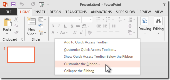
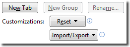
We’re going to go into the customize ribbon command. Right-click somewhere on the ribbon where there isn’t a button or control, and you’ll see the hidden commands. Choose Customize the ribbon and you’ll see the ribbon customization mess… er… UI.

right click taskbar and select Customize the Ribbon

Now, if you’re pretty perceptive you’ll notice something kinda weird.

customize ribbon ui

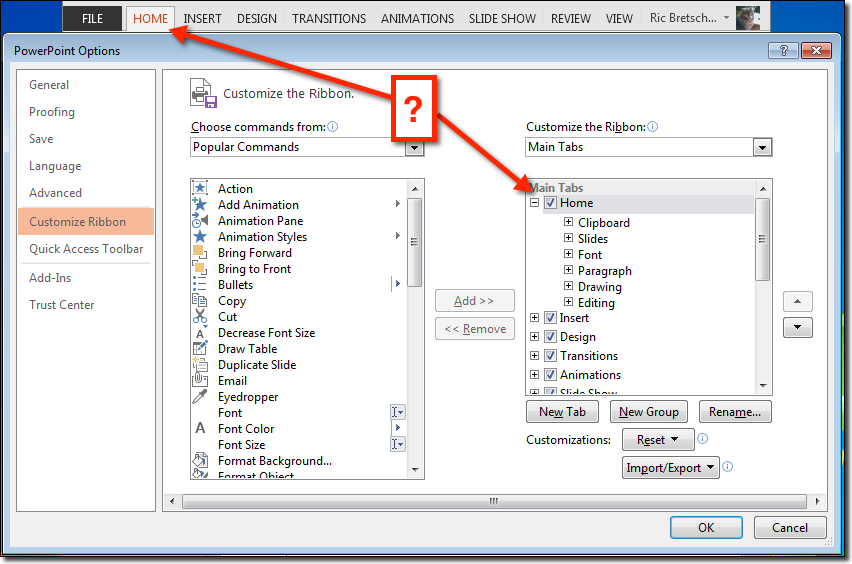
We’re looking in the right column, a list of the ribbon titles and the controls each ribbon contains. Funny thing is, all the labels are already in initial cap case. They are not in all-capitals. The UI let’s you change the name of any of these labels, see the Rename button beneath the list, but if you want to continue using the right names you’re kind of stuck.

The developers have special-cased these label titles for each of the individual ribbons so they display in all caps if they match the intended default label. Why did they spend their time doing this instead of fixing bugs or getting good features into the product? Who can tell. We can imagine the passionate arguments the designers put forward about not allowing users to destroy the delicate balance of their screaming grandpa design, but that’s just me recalling similar conversations. Probably nothing like that. But again, digressing.

A little experimenting will show you that the labels

Home displays HOME
HoME displays HoMe
HOME displays HOME

but it’s kind of hard to get it to just display “Home.” But not impossible. Just give it some space.

Or one space to be exact

Select one of the tab labels in the list and click the Rename button.  Adding a single space character, either before or after the letters “Home”, apparently is enough of a Jedi Mind Trick that  the developer’s force to upper-case code is told “these are not the glyphs you’re looking for” and they pass along to be displayed unharmed. Do this to each label, and you get a nice initial cap label and a much calmer interface.

lowercase tab labels

Yeah, Grandpa is still yelling FILE. If you can figure out a way to get him to calm down there, let me know.

A couple of things

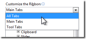
You may want to do all the labels ahead of time. There are more than what are initially shown. Just open the list at the top of the right column and choose All Tabs.

alltabscontextual tabs display at the bottom of the list

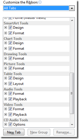
Notice a bunch of items got added to the bottom of the list. These are the “contextual tabs”, tabs that show up when you select certain things, like shapes and tables, to give you control over their options.

It does take a few minutes to change all of these labels, but you’ll find the pattern is pretty easy to get used to. Might take you 15 minutes to add spaces to the end of each label. I think that’s the easier technique to use.

And don’t worry about making a mistake. If you do, you can nuke all your changes and reset the UI to the defaults again. That’s what the Reset button at the bottom is for. You can reset all, or just the selected tab.

And One Last Thing

Which leads us to the last tip here. It’s Extra Credit, so feel free to skip it.

If you’re a writer or instructor or someone who needs, occasionally, to make your UI look like it’s fresh out of the box, you can use the Import/Export UI changes command.  It’s just beneath the Reset button.

the import/export change file command

This lets you save a file with all the customizations you’ve made as a file that you can reload later, even share between machines. So if you need to undo your changes and go back to the just out of the shrink-wrap smell, save your customizations, then Reset everything.

Later when you want to stop grandpa from screaming, just Import the saved settings again and you’re back to a calm, mature looking UI.

Let me know how this works for you.

This somewhat silly article is dedicated to my dear departed father, a grandfather and computer user himself, who eventually learned to just use all lower-case in writing his e-mail.

-Ric

Fun Fact: Did you know that the first few versions of the 
Apple computer did not have the ability to display 
lower-case letters? The keyboards had a shift key, but 
it was used almost exclusively for shifting number keys 
to access punctuation characters. The Atari and Commodore 
Computers were among the first personal computers to 
introduce lower-case letters as a standard personal 
computer feature!
Posted in Business, Design, Geeking around, Health and wellness, Personal, PowerPoint, Presentations, Random thoughts, Software, Thoughts | 6 Comments

Love of Books – An Unboxing of “The Fifty Year Sword”

I’m a big fan of books. Not just the stories, but the book construction as well. From bindings, paper choice, typeset, typography, layout, it’s all interesting to me.

Mark Z. Danielewski is most famous for House of Leaves, an inventive experimental work of layered stories and typographic morphing of most everything we think of as the printed page.

In this video I do a short review of House of Leaves for those who are not familiar with the work (and to allow those familiar with it to berate and chastise me for “getting it wrong” I suspect) and then do an unboxing of his latest work The Fifty Year Sword, which comes in a unique box and exhibits some of the same traits found in House of Leaves.

I hope you enjoy, and I hope those trying to make a purchase decision on this book are aided in their decision making.


preview

Posted in Books, Design, Entertainment, Geeking around, Movies, Personal, Technology, Uncategorized, Writing | 1 Comment

The Facebook Face Flip

This is not a political post, although a quick reading without comprehension will surely give some that impression. Trust me, and read on.

I was reading this evening about how you can actually see people “unliking” Mitt Romney’s Facebook page in real time graphics on a web site called Disappearing Romney. It sounded pretty wild, and the graphics on the page were conceptually stunning, but the whole thing was kind of sophomoric.  It looked like it might have been a prank.  So I decided to check his Facebook page to see if their math checked out.

It did check out, was really easy to confirm with a couple of page refreshes. But that’s not what caught my eye.

You see, around 100 years ago I took both high school and college journalism. A lot of it stuck, writing of course, but also a lot in the area of page layout.  There’s one guideline that borders on being magic in making a page and subjects on the page look appealing and interesting.

If you have a photo, or graphic, where a subject is looking in a left or right direction, place that element such that it is looking into the page, away from the edge they’re nearest.  If you have to, you can consider “flipping” the element such that it can do this regardless of what side of the page it’s on.

(Pause here to note how well I’m avoiding unnecessary political metaphors. Thanks for noticing.)

Check out the original, and see what happens when you flip both the photos.  It really is like a magic trick!

Flipping the elements of Mitt Romney's Facebook page we come away with a completely different impression.

You always try to have faces looking into the page, it makes them look better, the page look better, and the reader feel better. In this case, we have original Mitt back-to-back, looking very disconnected, even defensive. Look at how flipping both photos around makes him look, well, happy to see himself.

Arguably the wider cover page might work in either direction, and if it were left right-facing the light sourcing for each of these photos would match up, but that’s not a big deal.  I personally liked them facing each other, but your mileage may vary.

And yes, this is eminently applicable to your presentations!  Ah! You knew I’d get there eventually!  It’s one of the simplest things you can do to make your slides look more intriguing, trustworthy, or even happy.

Anyway, it’s not like it cost him the election or anything, but I found it really amazing that nobody on his staff, or even Facebook friends suggested fixing this classic journalistic page layout gaff.

Yes, I am available for consultations.

Posted in Business, Design, History, Media, Organizations, Personal, PowerPoint, Presentations, Random thoughts, Technology, Thoughts, Writing | Leave a comment

The First Thing to Do to Your New PowerPoint 2013…

Warning, I’m pretty opinionated when it comes to a garish design that I have to look at for hours at a time. I find it personally offending and I’m not going to mince words here.

Luckily there’s a quick fix for PowerPoint 2013, and I’m happy to share it with you before you suffer permanent vision loss…


Posted in Business, Design, Geeking around, PowerPoint, Presentations, Software, Technology, Thoughts | 3 Comments

Four Days to Better Presenting – Yes, You Can!

Oh dear. Another drab blog entry about presenting.  Well, maybe not.

If you hear the title Presentation Summit, you might picture an international cabal, those folks from around the world whose job it is to keep presentations bland, sleep-inducing and dreaded.  The Illuminati of bullet points, of text too small to read, creators of impenetrable charts, and irrelevant clip art.  Lord, I can picture them too!

But no, that’s not it at all.  In fact, its almost exactly the opposite.

Scottsdale AZ, Presentation Summit 2012

For almost a decade Rick Altman has been bringing expert professional presenters together at events around the country to show attendees that there is no inevitability to Death by PowerPoint.  Originally titled “PowerPoint Live” this Presentation Summit is something I personally look forward to each year whether I’m presenting or not.

What you will learn

To be a great presenter you need a number of things.

  • Respect for your audience – to know them, to know their needs, and to know how to move them
  • A message – what you are delivering, where you want to move your audience
  • Skills – crafting your message, making it meet your needs and engaging your audience
  • …and a certain je ne sais quoi. That certain something in your presence that makes the audience want to follow you to the end

And I’m not exaggerating when I say that you can grow your presenting skill set in all four areas at the Presentation Summit.

How’s it work?

The conference is three tracks of presentations, over three days.  There’s a bonus fourth day you can sign up for even more intense training.  The three tracks are

Design It, where you learn how to better construct slides to more clearly communicate with compelling graphics and just the right amount of message per slide.

Build It, the track that concentrates on learning the tools, presentation, photographic, and graphic construction, that help you craft the right presentation to support your conversation with the audience.

Present It, the art of standing in front of a room full of strangers and helping them see the benefit of your message. One of the most difficult things to do well, and certainly one of the most valuable skills to build.

Over the course of the summit, there’s more than enough to keep you busy and build your ability to present.  But there are also larger group sessions, mixers and networking opportunities, vendor fairs, group excursions… it’s hard to imagine how it all gets crammed into a few days.

Who is there?

OK, I’m one of the people presenting, and I’ll talk more about me later.  But I’m only a small part of a big talented crew.  Professionals from all over the world, from England to Australia, from India to Silicon Valley, it’s a talented team.

But I want to spotlight a couple of folks who attend who are closer to being the Presentation Illuminati, and certainly a lot nicer.  The PowerPoint MVPs.

PowerPoint MVPs at the Presentation Summit, left to right: Geetesh Bajaj, John Wilson, Echo Swinford, Me, Julie Terberg, Sandy Johnson, Troy Chollar, and Glenna Shaw – A few of the Microsoft PowerPoint MVPs who will be in attendance.

If you don’t know what a Microsoft MVP is, you should read about it here.  In short, they’re experts in a Microsoft application, chosen by Microsoft to have direct contact with the development team to provide feedback and help other users of the program.  The PowerPoint MVPs are the best of the best.  No brag, just fact.  Google any of the names above if you need evidence of this.

Interested?

So if you’re interested in finding out more, Rick Altman the father of the feast says it best on the Presentation Summit web site.  There’s more information on session specifics, the presenters, and how to justify going to your boss.  No kidding, it’s like he’s doing all the work for you!

A little fun

OK, a little fun now.  You may have noticed that the Sessions page for the summit has little videos from most of the presenters.  Mine should be up there, but I was late getting them to Rick and he’s off on some island now resting up for the run-up to the October event.  So they’ll be up there eventually, but in the meantime I thought I’d give you a sneak peek at what I’m presenting at this year’s summit.

Enjoy

-Ric

Pecha Kucha Lessons for Business at Presentation Summit 2012

I’m presenting on how business presenters can learn from Pecha Kucha presentations at this year’s Presentation Summit. This video is a short introduction for that session, which will appear on the Presentation Summit schedule page. I’ve given it a little twist of humor, which I hope you’ll enjoy.

Yes, some of the punchlines blink on a little too fast to see the first time. That’s intentional. I’m weird. Thanks for your concern.


Presenting on the iPad at Presentation Summit 2012

I’m presenting a how-to and how-not-to session on using the iPad as your primary presenting tool at this year’s Presentation Summit. This video is a short introduction for that session, which will appear on the Presentation Summit schedule page. I’ve given it a little twist of humor, which I hope you’ll enjoy.

Hint: Pay attention to the background.

Posted in Business, Design, Personal, PowerPoint, Presentations, Software, Technology, Travel | Leave a comment

Colorado

Batman Doesn't Use Guns

Certainly, a better role model than any pundit.

Stunned, I have few relatively important thoughts this morning.  This is the primary one.

Civilized people know they do not need “a militia.” The time for that has come and gone.

The retention of this false assurance is maintained by deluded fools, and arrogant liars. Neither of these should be allowed to hold any power in our society.

Posted in Uncategorized | Leave a comment

PowerPoint History, 25 years ago…

This has to be quick.  Sorry for any typos or errors, but I’m packing, medicating, and generally running about today and this could not wait.

I got a very nice letter from Bob Gaskins yesterday. If you don’t recognize the name, here’s a clue: He’s the guy who “invented PowerPoint”. Quotes are there because 1) there were a couple of other guys involved in the birthing process and 2) I think the product gets reinvented with every new release. However it was Bob who built the vision for the product and made it happen.

Bob’s written a new book, called Sweating Bullets: Notes about Inventing PowerPoint. He wrote it specifically to celebrate the 25th anniversary of PowerPoint. And I’m reading it right now (along with preparing for two separate conventions and five panels I’m on this weekend, I did mention running about crazily, right?).  So I’ll do more of a review later, but wanted to get this out to you, dear reader, because you’re special to me.

I’m really excited about this. Bob left just before I joined the team, and notes that fact on page 14, saying

Ric Bretschneider (Wizard #77) joined just after I left, stayed with the group for 17 
years (twice as long as I stayed)…

And of course there’s more, but you’ve got to read it for yourself or wait for my later review.  OK, one more thing, how’s this for a blast from the past…
It's kinda like looking at cave drawings....

It’s kinda like looking at cave drawings….

What else does it say?  What’s all that Wizard 77 stuff?  Well, you’ve got a chance to find out for yourself because it’s available on Amazon right now, right here:  Sweating Bullets: Notes about Inventing PowerPoint

I can’t wait to see how it ends…

Posted in Books, Business, Deals, Design, Geeking around, History, Media, Organizations, Personal, PowerPoint, Presentations, Software, Technology, Thoughts, Writing | 2 Comments

25 Gigs for Nothin’ And The Clicks for Free…

Ok, I’ll apologize for that title first. Sounded better in my head.

Wanted to get this out fast because according to a quick poll of friends a lot of people may have missed the news.

Hope you already had a Skydrive, because if you did you just got upgraded to 25 gigabytes of storage!

All you have to do is log in to Hotmail/MSN/live and click the link to Skydrive. If you’ve ever stored a file up there you should get an option to upgrade your account to 25 Gigabytes of storage for free!

It's like some weird intelligence test. "Um, 20gb for $10, or 25gb for free? I'm so confused."

Among cloud services that’s gotta be the best deal available. There are iPad, iPhone, and Win7 phone apps available and you can always access your files via login with browser. Also PC and Mac desktop apps.

It’s noted this is for a limited time, so head right over!  And, reader from the dark and mysterious future where this is already past, wipe your tears as the new base storage is an industry leading 7 gigabytes anyway!

Way to make the Google Drive announcement sound limp Microsoft!

Microsoft SkyDrive – Skydrive.live.com

Posted in Business, Deals, Geeking around, PowerPoint, Presentations, Software, Technology | Leave a comment

This is so easy to do…

There are some things that are such a pleasure to do, to pass along, to endorse… it kind of feels like cheating, like “duh” this doesn’t even have to be said.

Yeah, this is one of those.

I love the Duarte group.  Their talent, their staff, their ethic, their genuine passion, all so refreshing and inspiring. And when they produce something you, Joe and Jane Everyone, can hold in your hand for a couple of bucks, well that’s really cool.

Today Nancy Duarte announced on the Duarte blog the publication of the iPad version of their book Resonate.

And I’m going to stop right there. No further loving hyperbole.  No more glowing endorsement.  Just one instruction that will cost you absolutely nothing.

If you have an iPad, click here to get to the iTunes page. There it’s easy to download the free sample of a section of Resonate.  Watch that.  Read it.  You’ll be captivated from the first match strike, from the inspired visualization of how an idea travels between people, the power of a speaker and audience connecting, and then you’ll start to learn to do it yourself.

Yeah, that was really easy.

Posted in Business, Design, Geeking around, History, Home and Family, Media, Movies, Software, Travel | 3 Comments

GoPayment Vs. Square – One More Thing, One Less Thing…

I signed up for Intuit’s new GoPayment card system yesterday. Thought I’d share a few thoughts.

GoPayment is a way for regular folks to take credit card payments from other regular folks using your cell phone or tablet.  It’s advertised pretty much like the Square system, the first credit card device and service for regular folks. The major benefit is that it’s cheap, no monthly payment, and it has a cute device that plugs into the phono jack on you device that you use to swipe the card. Both GoPayment and Square charge a very low percentage per transaction (Are you listening PayPal?) lower than commercial rates, and no monthly fee.  GoPayment is so much like Square… well I haven’t seen any written description of it that hasn’t included a reference to Square. I’ve liked the Square system, but was curious about Intuit’s entry.  Given it was free, I figured what the heck, give it a try.

Intuit GoPayment System

Intuit GoPayment System

Haven’t got the reader yet, but already it’s coming across as a whole lot more in my face than Square.

I got a big follow-up annotated bill in e-mail this morning with a lot of line items and $0 due notations. Like that’s supposed to make me feel good? My first reaction was “WTF? A bill?” OK, maybe that’s just the three cups of morning coffee talking.

What really bugged me was GoPayment had this “hidden” credit card they issue you as a way to get your money. That wasn’t at all obvious until I got the confirmation that I’d ge getting the card in the mail.  I don’t know about you, but I really don’t need or want another credit card.  Not for SkyMiles, not for Dinner Credits, not for an additional 5% off on my purchases. It’s already hard enough to track my intentional spending, and if I was the victim of identity theft I want to make as few calls as possible if it becomes necessary to shut things down. So I try not to have a lot of credit cards, especially specialty cards.

Square and Devices

Both systems work across all major smartphone devices, but Square hires a better photographer for their ads.

Of course,  after a call to their customer service, it turns out I don’t have to use or keep the card. I kept saying things like “So when I get the card in the mail, I can destroy it immediately and not have that affect my GoPayment account?”  The guy was a bit unnerved about that, suggesting I activate the card first, then call in to terminate it.  Um.  Yeah.  That makes sense.

You can still get the money transferred to one of your accounts, just like Square does, but they default to using the rechargeable credit card.  But how many people are really going to rebel like me? So many just accept that “well this is the package, guess I’ve got a new card to monitor.”  And we all know that terms on cards can change when the bank thinks it’s not getting enough profit on your business. Right? It’s just another thing to monitor, reading all the bland, poisonous notes in the monthly statements. And I hate that.

If I was going to devil’s advocate their design decision here I’d guess they found that most people were unable to complete their process if it required the banking codes necessary to do the direct deposit dance. Issuing a credit card was much easier, just requiring an address, social security number, and a couple of additional personal data chunks. Probably, but that’s a big part of what’s wrong with the credit industry in general. I’m not going to dig in on that speculation, it’s not the real devil that I think is in play here.

I’ll probably give it a whirl when it arrives, but I expect I’ll be dumping this. Square stays silent until I use it. So far it hasn’t tried to sign me up or send my info along to other companies. I’m not feeling the same warm fuzzy about Intuit.

Posted in Business, Geeking around, Personal, Random thoughts, Software, Technology, Thoughts, Uncategorized | 17 Comments

Update: Toaster

Update! We replaced with the same model, this time in purple. They were out of red.

Frankly, the toaster market is insane with technological innovations. There are models that slowly lower your toast into the chamber, any number of digital displays, warming buttons, angled slots (which if they don’t actually launch onto the plate… well that’s just a missed opportunity!) and any number of additional innovations to the act of browning bread that trying to satirize the product is ultimately futile.

Most expensive model we “considered?”  $140.  And when I say considered I mean Deb continued to talk to the salesperson while I faked an aneurism.

Final cost of the same model.  $29.

There, story is complete.  You can sleep at night again without worrying.

Posted in Uncategorized | Leave a comment

QuickTechThought: Our Red Toaster

Our pretty red toaster died this week.

Sunbeam Oster. It wasn’t even three years old.  I know, I know, they don’t make things like they used to.  But it’s just a toaster, it’s supposed to be pretty fundamentally simple.   Remember the toaster in Red Dwarf?  The joke was they had put all the crazy AI and voice tech in the toaster such that it drove the user crazy suggesting that “now was a great time for a piece of toast.”  Well, this one just has a bunch of buttons for various preset bread types, and a dial for darkness.  Nothing terribly cutting edge.  (Wait a minute… bread type settings?)

Reading up on this brand I see comments about failures and people opening it up to find “scorch marks on the circuit board” and how they really didn’t think they had the components to fix the board themselves. Which lends to three questions:

1. There are people who consider trying to fix the circuit board in a $40 toaster?

2. How did we get along for decades with toasters before we had integrated circuits?

3. And why doesn’t this thing connect to our WiFi so it could have downloaded an update that might have prevented the scorching, or at least a security patch?

Feeling a little weird about disposing of the toaster too.  I guess it goes on the pile of outdated or broken tech junk waiting for a tech recycling day at the local middle school.  Given it has circuits it’s likely there are components that shouldn’t go into landfill.  And it’s still so shiny and pretty, it feels wrong to dispose of it just yet.  Maybe we can rip the guts out and make it into a planter.  Isn’t that the solution for so many of these problems?

Posted in Design, Food and drink, Geeking around, Home and Family, SciFi Fantasy, Technology, Thoughts, Uncategorized | Leave a comment

The Ultimate PowerPoint Survivor…

Here’s a trivia question for you.  PowerPoint has been around forever. Bob Gaskins, the father of PPT puts the start date for the team as 1984.  Lots of great folks have come and gone, and a few have even come back.  But who is the one person who has been on the team, without leaving and returning, the longest?

That would be Judea Eden.

Judea Eden Back Then - Photo by Bob Gaskins

Judea Eden was the 17th person to join the ranks of The Wizards of Menlo Park, the core group of folks from the earliest days of PowerPoint – those who pretty much set the pace for the application.

If you’re curious, I joined that team in 1993, and am 77th on the list.  To put a point on this, there are only two people still at Microsoft who predated me, and Judea was the winner for having been there the longest, still on the core PowerPoint team.

We think about the brains and wills behind the development of the PowerPoint application. But if you were looking for the heart of the team, I’d say Judea is a great candidate for that recognition.  You see, Judea kept the PowerPoint team flush in supplies, equipment, and more that a little late-night food during crunch time.  She organized all our off-site and team building activities, coordinated resources for moves between sites and buildings.

And she added more than a little humanity to the group.  She’s a sweetheart, through and through.  She cares about everyone on the team, even those who might not really deserve that care.  Because, dear reader, she’s just sweetly guileless and truly wants to make people happy.

Onward to a bright future...

When I joined the team, we worked in an office on Sand Hill Road in Palo Alto, CA.  I’d really resisted the idea of going to work for Microsoft, even on the PowerPoint product, an application I really liked.  But it was Microsoft, the company that had always beaten the companies I’d worked for before.  I really felt like I’d stepped into enemy territory, and I doubted that I’d make any friends or actually be there very long.

At noon on my first day this girl appeared in the doorway to my office, I’ll always recall she had a shiny black plastic lunchbox-styled purse, and said “Hi, I’m Judea, wannna go grab some lunch?”  Because that’s what Judea does, she makes you feel welcome.

My first friend at Microsoft, and we’ve been friends ever since.

Judea is an amazing amalgam of interests and talents.  A few years back she started a serious study of nutrition and health. In fact that’s part of the next phase of her life, working for a company in the health and wellness.

But there’s a crazy-fun side to Judea too.  She’s the lead singer for The Judea Eden Band, and if you’re lucky enough to be able to catch one of their shows in San Francisco or around the Bay Area, I highly encourage you to do so.  You can thank me later.

So, after a quarter century (and the years don’t show at all kiddo!) Judea is moving on and up to a position in another company, leaving Microsoft diminished for her leaving.  Her last day is Friday the 13th, 2012.  I hope that’s not a bad omen for those she leaves behind.

I can only say thanks for being my friend.  The PowerPoint world would have been a much lesser place but for you.

Posted in Business, History, Organizations, Personal, PowerPoint, Presentations, Software, Technology | 5 Comments

How Facebook Will (May Have Already) F#@k You Up

Really, I’m not doing much here.  Just trying to draw your attention to someone else’s work on how Facebook’s recent bout of ill-conceived changes continue to mess with your privacy, your communications, and your ability to actually use the system without getting screwed-up.

It’s essentially the same problem.  The code monkeys at Facebook have decided that they know better than you how you want to get your information, or more importantly, they’re deciding what information is important.  They’re trying to prove how smart they are by writing algorithms that watch what you do, analyze words in messages, and essentially hide a shit-ton of stuff you probably would prioritize higher than they do.  Any time you have someone who has doubtable social skills managing your social interaction, you are doomed.

From Slate Magazine - Used to promote their story And Facebook is no better at predicting what you want to see than any other company.  Do you recall that old chestnut “My Tivo Thinks I’m Gay“?  Well here we are a decade later and Facebook thinks you don’t want information from someone you just met, haven’t actually met but who really needs to get in touch with you, or haven’t spoken with for a while because they only recently decided to forgive you… the list goes on with the potential ways Facebook will or may have already f#@ked you up.

This time, it’s messages.  Did you know there’s a whole bunch that Facebook pushes off into a separate area without EVER giving you a surface level indication that they’ve arrived?  Yup, we can thank Slate Magazine’s  for sharing her experiences today in Furious at Facebook Again!

Seriously, when are these guys going to be sued for abusing their customer’s information?  This is an area where we set serious and definitive precedence.

Posted in Business, Design, Geeking around, Home and Family, Media, Organizations, Personal, Random thoughts, Technology | Leave a comment

Nest Learning Thermostat

Last Friday I installed a new thermostat in the house, the first one since we moved in.

Now the prior thermostat was programmable, hourly and daily you could configure it to heat and cool as you like.  It made a lot of sense at the time, but so did parachute pants.  Yeah, it’s been a while.  Unfortunately programmable thermostats don’t take into account when you’re gone, you have to remember to override the programming (time-consuming and bothersome) or turn the thing off (and come back to a frozen cat.)  But it was better than the manual option of course.

Now a company called Nest has come out with a Learning Thermostat.  One that tracks your use, and presence, and uses that information to anticipate the best settings for you at any given time.  It’s also a green device, and will help you try to use less energy while staying comfortable.

The Nest Learning Thermostat

The new thermostat. The green leaf means we're saving electricity. And that we're cold.

I’m not going to rewrite their web page (which you can view here) but wanted to show you a little walk-through video I made to answer all my geeky friends questions.  Click here to enjoy the video on YouTube.

Posted in Design, Geeking around, Health, Home and Family, Personal, Random thoughts, Technology, Uncategorized | 1 Comment

The 300!

Harlan Ellison, Ric Bretschneider, and a 1970 Dodge Challenger

Chris Garcia did an amazing thing.

He invited, then managed contributions from, over 300 people for the 300th issue of his Hugo Award Winning fanzine The Drink Tank.  James Bacon helped, and gets his share of the credits, but Chris is the one I want to focus on for a moment.

Chris won the Hugo award for best Fanzine this year at the 2011 World Science Fiction Convention.  He’s been nominated more than a dozen times, and all his friends hearts swelled as one when we heard the news.  Some of us had the pleasure of being in the audience, and watching our favorite fanzine editor and computer historian dance about the stage like a crazed Quaker.  You kind of had to be there to understand.

This issue is a bit of a download, but I hope you’ll give it a look.  There isn’t a table of contents, per se, but instead a series of numbered bits.  Mine are 72,  73, 132, and the two page picture comic that’s in the middle of the Bios section, about seven pages from the end of the issue. That last bit might go a ways towards explaining that whole crazed Mormon thing.

Anyway, you can download the issue here.

Posted in Uncategorized | Leave a comment

This Just In: Microsoft Fails to Get the Macintosh – or just good installation practices…

Just got notified that there’s a Silverlight update for the Mac. OK, I’ll update, what’s the…

Wow. The instructions are so dense with unnecessary text, and eventually tell you to first uninstall any previous version, which necessitates removing half-a-dozen files from the Macintosh library manually. Confused? Of course you are! You’re not supposed to have to go mucking around in the Macintosh Library unless you’re a developer or you’re trying to recover from a poorly written application that has screwed up your settings at a very base level.

Silverlight Installation

Let's be clear. You should NEVER have to go to the Library for an uninstall.

Of course you can watch a video on how to do this. By the way, the video is a WMV, Windows Movie file – guess it would be too awful for MSFT to provide a system native Quicktime for the Macintosh-specific instructions. This is starting to feel like it was written by someone who wanted the user to break their Macintosh. And the video conflicts with the written instructions on the web page which show many more files to delete than the video does.

Huh.

Did I mention that telling people to go into the Macintosh library and manipulate files is like telling Grandma to wet solder a circuit board – just not supposed to happen.

Really? Really? Are you trying to be a self-parody of a clueless conglomerate with lazy developers?

I’m no longer defending Microsoft when people accuse them of not “getting the Macintosh.” I’ve done so for many years, saying how many people in the Mac business units really do know and enjoy the Mac. But this has made me so embarrassed to have been involved with developing multiple applications, both on the Microsoft Office team and at eBay, that were dependent on this tech*.

Embarrassing.

By the way. I stand by my prior statements that there are hundreds of Microsoft employees who appreciate, understand, and like the Mac. They live and die by the quality of work they do in making applications like PowerPoint really useful for those trying to co-exist with a predominately Windows business world. I have nothing but respect for those individuals.

Not so much for the Silverlight team.

— Notes —
* While developing the Web Companion for PowerPoint at Microsoft, I was the PM for the team that used Silverlight to render the slide show in a window that would scale the slide interactively when the window was resized.  Without Silverlight installed the image would be a static fixed size.  When I joined eBay I took over the Simple Lister project, a stand-alone Silverlight application that experimented with creating user product listings in under a minute.

Posted in Business, Design, Geeking around, Software, Technology, Uncategorized | Leave a comment

My iOS 5 Update on iPad

Just finished the iOS 5 update on my iPad 2. Man, what a marathon. It basically needs to back up your data, reset the device, update the OS, then restore your data. So plan for a few hours to completion. I have no idea how people without a computer (wasn’t that the promise?) would do this.

There’s some nice stuff here, you can read about that on the Apple site easy enough, but I’m not rushing to update Debbie’s iPad any time soon.  Not until I’ve made sure I’m aware of all the sharp corners here.  To that effect…

Two Hiccups:

  • When update was “finished” I noticed I only had sound in apps that specifically were made to play sound (like Garage Band for example.) Very strange. Took about 30 minutes to realize that Apple had reset the option of how the physical switch near the volume control buttons work. I’d set that against the default, so it managed locking screen rotation (the original function, and absolutely necessary for those of us who read in bed.) They set it to control sound muting, and apparently the setting for free rotation is the same as mute. Wow, I imagine this is going to burn a few users.
  • Second is that apparently some downloadable content may be corrupted or just not migrated properly. Comics on Graphic.ly all came up as black pages. Had to uninstall the Graphic.ly app, then reinstall and redownload the issues I’d put in my library. Luckily that was only about a dozen, but that could be really painful for someone who bought a lot of comics.

Siri - Not 4 U iPad!

Biggest disappointment: Siri is not on the iPad. There’s really no good reason for this, other than to drive people to iPhone. And we’ll have to see how well that works. Android voice commands work very well, and is integrated in all the right places, but I rarely use them. Siri is not a game changer, it’s just a game.

Useless features:

  • Reminders task List – Frankly anyone who isn’t using WunderList will be pleased with the Apple task list app.  However, it’s not near as cool as Wunderlist, is not cross-platform, does not sync to your Windows or Android devices… well, let’s just say I’ve buried this app inside a “Utility” folder to keep it out-of-the-way.  Why Apple made this lame addition an “essential” app, one you can’t delete, is just mind-numbing hubris. Go find Wunderlist and thank me later.
  • Grid in Camera.  Don’t get me wrong, the rule of threes is essential for good composition.  However just adding a grid to the camera is so Apple – no documentation or help in figuring out why you would turn it on.  Come on Spartan design sense, surely even you can give a hint now and then.
  • Newstand.  Just another Apple money grab.  My non-newstand publications sit on a page around a Newstand app with two demo pubs in them.  It just looks lame and yes!  You can’t delete this Essential app either.

May update as I learn more.

Posted in Business, Design, Geeking around, Random thoughts, Software, Technology | Tagged , | 1 Comment

The PowerPoint Team Blog…

Well, everything old is new again.

Today the Microsoft PowerPoint Team Blog did me the honor of pointing out one of my posts from earlier this year, The Blur Trick, with an invitation to write more later.

I had the fun of writing a re-introduction for myself, for the blog I got started and which still contains entries I hope continue to help customers.

Hi, I’m Ric Bretschneider.  You might remember me from…well, the very first entry in the PowerPoint team blog back in 2006 and a lot of tips and tricks articles after that. I left the PowerPoint team and Microsoft about a year ago, but I’m still very involved with helping people become better presenters, and make better presentations.

I’m very pleased that the PowerPoint Blog team invited me back to share an article, written earlier this year on my personal blog, calledThe PowerPoint Blur Trick. You can add texture or blur the background of a picture using the Artistic Effects feature in PowerPoint 2010, leaving the foreground crisp and clear.

If you missed it before, hope you enjoy it today.  And we’ll see what I can come up with later.

-Ric

Posted in Uncategorized | 2 Comments