This is not a political post, although a quick reading without comprehension will surely give some that impression. Trust me, and read on.
I was reading this evening about how you can actually see people “unliking” Mitt Romney’s Facebook page in real time graphics on a web site called Disappearing Romney. It sounded pretty wild, and the graphics on the page were conceptually stunning, but the whole thing was kind of sophomoric. It looked like it might have been a prank. So I decided to check his Facebook page to see if their math checked out.
It did check out, was really easy to confirm with a couple of page refreshes. But that’s not what caught my eye.
You see, around 100 years ago I took both high school and college journalism. A lot of it stuck, writing of course, but also a lot in the area of page layout. There’s one guideline that borders on being magic in making a page and subjects on the page look appealing and interesting.
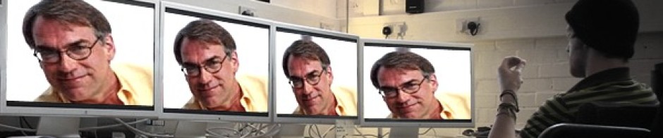
If you have a photo, or graphic, where a subject is looking in a left or right direction, place that element such that it is looking into the page, away from the edge they’re nearest. If you have to, you can consider “flipping” the element such that it can do this regardless of what side of the page it’s on.
(Pause here to note how well I’m avoiding unnecessary political metaphors. Thanks for noticing.)
Check out the original, and see what happens when you flip both the photos. It really is like a magic trick!

You always try to have faces looking into the page, it makes them look better, the page look better, and the reader feel better. In this case, we have original Mitt back-to-back, looking very disconnected, even defensive. Look at how flipping both photos around makes him look, well, happy to see himself.
Arguably the wider cover page might work in either direction, and if it were left right-facing the light sourcing for each of these photos would match up, but that’s not a big deal. I personally liked them facing each other, but your mileage may vary.
And yes, this is eminently applicable to your presentations! Ah! You knew I’d get there eventually! It’s one of the simplest things you can do to make your slides look more intriguing, trustworthy, or even happy.
Anyway, it’s not like it cost him the election or anything, but I found it really amazing that nobody on his staff, or even Facebook friends suggested fixing this classic journalistic page layout gaff.
Yes, I am available for consultations.