It’s been a while between posts, so I wanted to give you something special. It’s a little longer than most, but I think you may find it worth your while. -Ric
Sometimes the right collection of commands and techniques in a software package is like a good magic trick. You don’t see the result coming until it’s right there in front of you, and it surprises you how easy it was and how good it looks.
Today I’d like to share a magical photo technique I stumbled upon in PowerPoint. It’s a version of something that pro photographers have been doing in Photoshop for years, but I think you’ll agree that this is simpler, and hey – you don’t need Photoshop!
You need to have Office 2010 (or 2011 for the Mac) to do this, because it requires a couple of features that don’t appear in earlier versions. Sorry about that, but you really should upgrade – 2010 is the best.
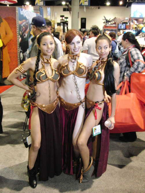
To start with, you need a photograph. I’m going to show this off using two different photos, both of which have “compelling” subjects, but have backgrounds that might distract or otherwise detract from the photo.
There are three features we’re going to concentrate on:
- Background Removal – Allows you to eliminate portions of a photo easily, typically leaving an object in the foreground
- Artistic Effects – Which apply various visual distortions to photographs
- Selection Pane – Makes it easy to identify and select shapes and images on a slide
Start by inserting a photo into PowerPoint. Resize as necessary and if you want it’s a great time to crop the photograph before you start enhancing it.
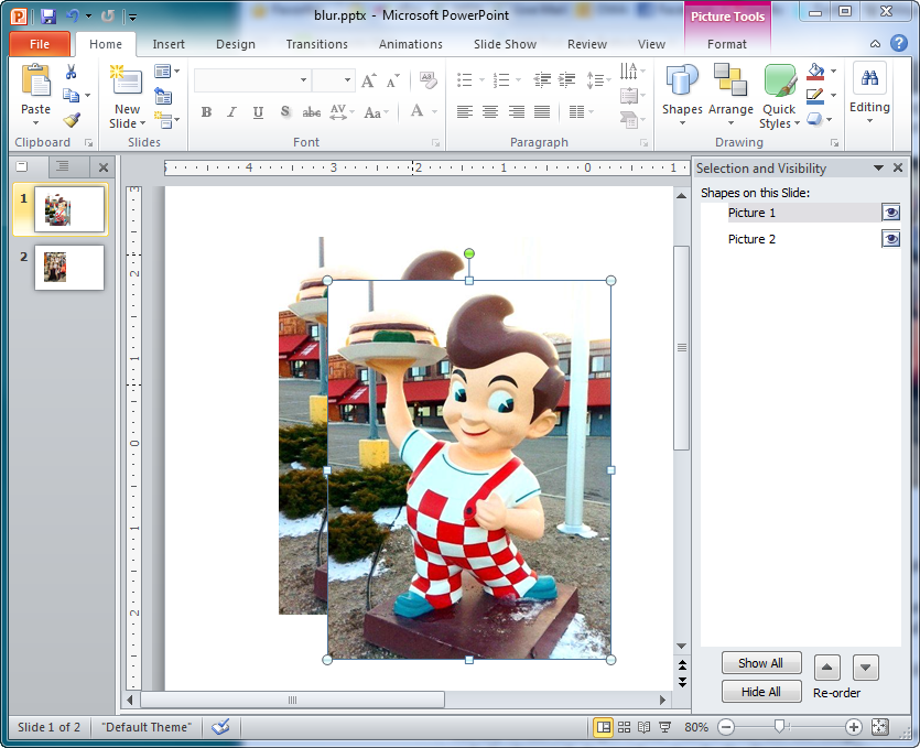
The key to this technique is that while it looks like one image, we’re actually dealing with two, a foreground and a background. So start by using the Duplicate command (CTRL-D) to create a second copy. Then open the selection pane (it’s in the Home tab’s Arrange menu). Things should look something like this.
With the selection pane open it’s easy to see that Picture 1 is on top of Picture 2. Your results may vary, don’t worry about the numbers – they’re going away soon. Click on that name and rename it to Foreground, then rename Picture 2 to Background. That will make it easy to keep track of things later.
Now we need to align the two shapes. Press Ctrl-A to select everything, then use the Arrange menu’s Align Center and Align Middle to put them exactly on top of each other.
We’ll start using the Background removal command now, but before that we need to hide the photo labeled Background (if that doesn’t make sense yet, hang on, it will in just a little bit.) In the Selection pane, click the Eyeball icon to the right of the label “Background”. Don’t worry, you shouldn’t see any difference because the hidden Background photo is behind the Foreground photo.
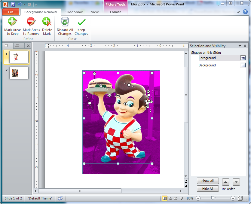
Now click on the label Foreground in the selection pane, and click on the Picture Tools Format tab. All the way to the left is the Remove Background command. This is a pretty cool tool that might take a little getting used to at first, but is a whole lot of fun once you do. Basically use the tools to get your background removed so just the foreground image is visible. If you’re having difficulty with the command, you might want to check out a blog Chris Maloney wrote on using Remove Background.
How precise you want to make this is up to you, for the purpose of this technique you can actually be a little sloppy. Eventually you want things to look like this.
Click Keep Changes and note that you should have a nice cut-out of the foreground. Now click the Eyeball icon next to the Background label in the selection pane again. No surprise there, the background is back. But we’ve isolated it from the foreground because it’s actually behind the foreground image, and that’s where the magic can happen!
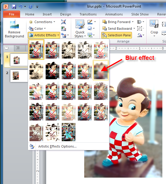
Click the Background label to select the Background image again. Now click the Picture Tools Format tab again, but this time we’re going to play with the commands in the Artistic Effects menu. There are a lot of these, but let’s use the Blur effect first.
As you can see, the ability to apply the effects exclusively to the background makes the foreground image “pop” more without making it look totally unnatural the way a simple cut-out would. Professional photographers commonly apply a similar blur effect to magazine and portrait work – so you can now get out there and start making the big bucks too.
By now you may have noticed that the Artistic Effects update as your pointer moves over them, and you may have stopped reading already just to play with the different effects. That’s cool, if you have then my mission is already accomplished. But there’s one more step you should know about, getting the picture out to use elsewhere!
Because this effect uses two pictures, you’ll have to combine them in PowerPoint before you can export the picture. Simply press Ctrl-A again to select everything, then CTRL-G to Group the images. Now you can right-click the group and use Save as Picture to export them as a single image you can use anywhere. Again, a before and after example.
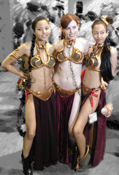
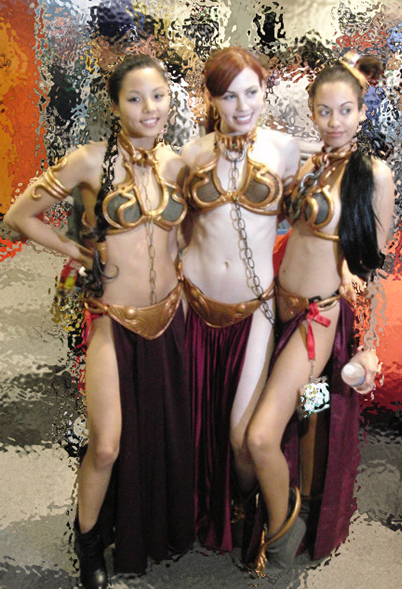
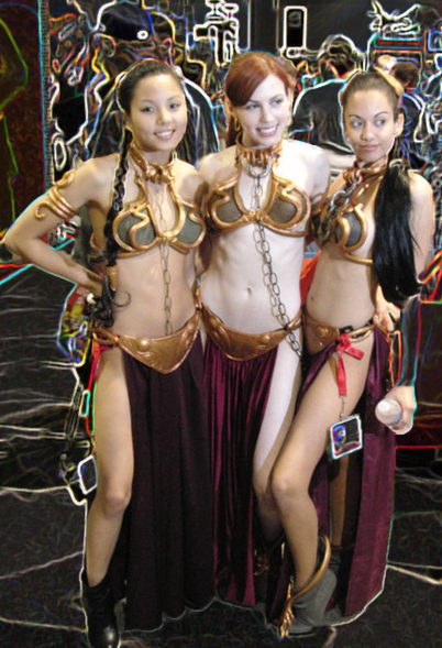
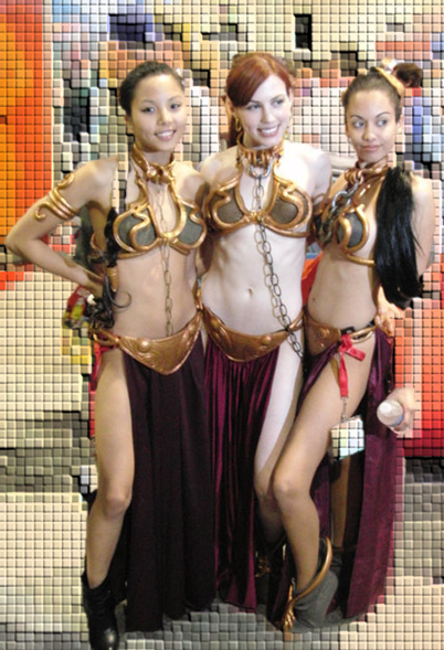
But getting back to the other effects you noticed before, there’s a lot of fun to be had here. Again, with the Background image selected, try out the other effects just to see how things look. Here’s a small gallery of examples to enjoy.
Hope you have as much fun with this as I do, and let me know how well this works for you!
-Ric January 9th, 2011
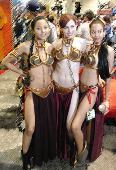
Photos by Chuck Farnham (Bob) and Ric Bretschneider (ComicCon Slave Girls) not to be reused without permission.




Very helpful!
I have a related question. Is it possible in powerpoint to present an animation in which a still image begins very blurred and gradually comes into sharp focus?
One very simple animation technique comes to mind – basically card flipping between states. Take the image and duplicate a number of times. Let’s say 10 or so for the average image. Then, using the selection pane, rename them 1-10 just so you can keep them straight. One is the unblurred image, 10 the most blurred (10% jumps with each change). Align their centers in order with 10 on the bottom and 1 on the top. Now open the animation pane and set each image to APPEAR with the AFTER timing (you may want to add a very small delay). That means the 10 will show up first, and then 9, and so forth to 1, with each new image obscuring the one before it with a lesser level of blur.
You can tune this effect with more images, more or less time between APPEARS. If APPEAR doesn’t work for you, play with some of the other effects like DISSOLVE.
Cheers,
-Ric
Three years can make a big difference. You can do this easily in the current PowerPoint by using the Morph transition. There are lots of articles on how to use morph, but if you can’t figure it out ping me again.
Hello Ric. Could you please explain how to blur only a part of an image (for example, the upper half only). Thank you!
Hi, it’s fairly simple. In your example, wanting to blur the upper half of a photo, you would start by duplicating the photo and making sure it’s exactly aligned with the original. Then use the crop tool to remove the bottom half of the copy, and apply the Blur artistic effect to it.
Hope that helps!
-Ric
Pingback: PowerPoint Tip: Stacking Artistic Effects | Ric Bretschneider
Thanks for the tip, this was very helpful.
loved it!! thankuu so much… :)
This is great but I don’t have a “remove background” option in my Powerpoint. I have the 2007 version. Am I missing something?
Yes, as I mentioned this feature is only available in PowerPoint 2010 for Windows and 2011 for Macintosh. Thanks!
I too am missing several options in the Adjust section of Format tab. I have MS Office 2010. Thoughts?
Not sure what exactly you’re talking about. Perhaps you can review your situation and tell me the expected commands and where you thought you would see them?
Thanks!
Nice – that’s the sort of thing I usually have to resort to Photoshop for!
Love this! I tried it on a picture of three of us in Austin at the Summit, and used several different backgrounds besides the blur…it’s great!
Pingback: The PowerPoint Blur Trick | Blurpme | Latest Technology Feeds
Pingback: The PowerPoint Team Blog… « Ric Bretschneider
Pingback: Highlight one part of an image in color « PowerPoint Tips Blog
This is awesome. I’m just seeing this! Love this trick, Ric.
Great tutorial, Ric!
Nice post, Ric — thank you — just tweeted this one.
Nice tut. I also recently used the blur effect to make an image a little more acceptable in a tutorial I’m putting together.
Hi, nice post. I’d suggest to take a look at http://www.free-power-point-templates.com if you need free templates for powerpoint.
I like your examples!
Recently I used the Blur-effect to hide personal information in parts of a screenshot. I used the Crop-tool to leave only the personal information on the copy in the foreground and applied the artistic effect Blur to that. Then put the un-cropped and un-blurred copy in the background to show the headlines etc.
A video using that effect will appear soon on our blog.
This is very cool- love it!